Why Should You Create Infographics?
Stimulate Your Readers Mind Visually
There are many reasons why infographics can be seen as efficient content marketing tactics. Firstly, they are easy and affordable to create. Secondly, they activate our brains in a totally different way than plain written text.
The main reason for this is that infographics are visual representations of information. By using visuals you will thereby activate both sides of the reader´s brain: the rational and the emotional sides - which, in fact, both work closely together in decision making.
Having this in mind we can conclude that an infographic might be a smart solution to help support your long, text-based corporate PDFs in the future.
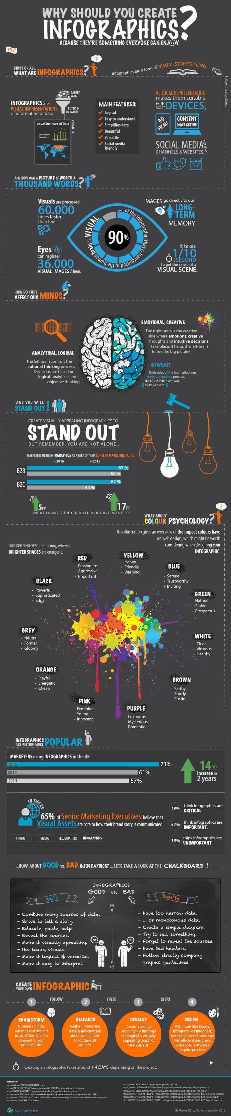
Check out this infographic by Market-Inspector to learn more about why you should create infographics.
Infographics Are Booming!
The Content Marketing Institute (CMI) reports an increased usage of infographics in both B2B and B2C markets between 2015 and 2016. Content marketers reported an increase of 5 percentage points in B2B markets and 17 percentage points in B2C markets.
Not only has the usage increased, infographics are also seen as more efficient content marketing tools than ever before.
To put that into perspective, in a previous B2C report by CMI only 42% of respondents thought infographics were efficient content marketing tactics. This year that number rose to 63%.
In B2B markets the respective numbers were 50% in 2015 and 58% in 2016, which, in fact, was the biggest leap among all content marketing tactics measured in recent reports.
An Infographic Is Worth a Thousand Words
The visual representation of information allows infographics to be interpreted much faster than plain text. This can be argued in many ways since some people are left brain dominant, whereas others are right brain dominant.
But, what are the differences between the left and the right sides of the brain?
For more information read this inspiring post by Funderstanding. Even if one side might be more dominant, in the end, both sides still work together. That is the reason why infographics can be used to display a lot of information and still be easy to interpret for the reader.
As illustrated in the infographic, visuals are processed 60.000 times faster than text. That is only one of the breathtaking facts about how efficiently the brain can process visual information compared to plain text.
A Versatile Tool for Content Marketing
Since infographics usually are vertical representations of data they are applicable for more or less all devices. You can also publish them on most of your social media channels to attract more visitors to your website.
You might now think that it is impossible to publish an infographic on, let's say, Instagram, which is totally reasonable. Even though you can crop a part of your graphic and use it as a teaser on Instagram, and this way drive more traffic to your website. You just need to be a little creative with your tactics.
Use of Colours in Your Graphics
Colour psychology can be a complex topic to discuss. How colours affect our behaviour and emotions can vary depending on where and in what way you use colours.
For instance, many fast food chains use the colour red to trigger hunger. In the infographic above we have focused on the impact colours have on web design; where red is usually associated with passion, aggression and importance.
It is important to remember that colours can trigger both positive and negative emotions, which might be worth considering before starting your infographic.
Try not to have too many colours in your infographic, but if it makes sense to have a colour splash or similar (referring to the infographic above) to support your information - go for it! Strive to create a nice contrast so that all the elements in your graphic will be easy to see.
What Is a Good Infographic?
It might be impossible to determine what is the perfect infographic because it has a lot to do with creativity and design. There might be thousands of ways to present a combination of complex data, and many opinions on which of these is the best way to do it.
Even though, there are a few things that are good to keep in mind when figuring out how to design your infographic. Try to find many sources and strive to create a story out of the information you find. Remember to reveal the sources in case that the reader wants proof or to read more about the topic. Usually, this is done by adding a source list at the bottom of the infographic.
The idea is to make information (preferably a lot of information) easy to understand. When you have collected the data, find a way to visualise the data in an understandable way. The most important feature of infographics is that they should be logical and easy to interpret.
Now Create Your Own!
If you are a first-timer you might need to reserve a few days for creating your infographic. We have compiled the entire process into 4 simple steps to help you along.
Brainstorm
Find some topic that you are interested in and that is related to your website, blog or business in some way.
Research
Gather interesting data about the chosen topic. Remember to save the sources so it will be easy to find them again when you are ready to add them to your infographic.
Develop
Create a plan to present your findings in a logical and visually appealing infographic. Remember to use visuals, making the information easier and faster to process.
Design
There are multiple tools that you can use to easily create infographics. Tools like Infogram, Piktochart and Easely are a few of the most common ones used by content marketers. With these tools, both beginners and professionals can become efficient designers, because they are filled with various easy to use templates and icons to choose from.
Check the video, it´s very easy!

Depending on how much information you are presenting, the process can take around 1-4 days. As said, as a beginner, it may take some time to get used to it, but shortly you will be a master of infographics. Good luck!
Note: Find all sources at the bottom of the infographic
We strive to connect our customers with the right product and supplier. Would you like to be part of Market Inspector?
